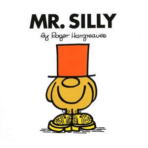
 I loved the Mr. Men / Little Miss books by Roger Hargreaves when my kids were small. The stories were just the perfect blend of simplicity, absurdity, and insight. They were just long enough. The illustrations were engaging, funny, and wonderfully colored.
Plus I really liked the format and the way the books felt in my hands. Open to any page and you’ll find text on one side, with a full-page picture on the other. Naturally I decided that would be the perfect layout for my Simplicity Cycle book.
When I self-published it at Lulu.com, I was able to pick a square print size (just like Mr. Men!), and set out to write a book that walked the reader through the Simplicity Cycle diagram one step, one picture, at a time. In that version, open to any page and you’ll find an image on one side, with explanatory text on the facing side.
In fact, that layout is what I initially proposed to my editor at HarperCollins when I signed the contract. She wisely & correctly suggested a more traditional approach, which really did work better in the long run, but part of me still really likes the concept.
NEXT: Free Books!